BACK TO HOME
BACK TO HOME
BACK TO HOME

A UX Case Study: Redesigning the
Homepage for Docufy AI
A UX Case Study: Redesigning the Homepage for Docufy AI
A UX Case Study: Redesigning the
Homepage for Docufy AI
Docufy AI has a powerful and complex product, but its current website makes it difficult for visitors to quickly understand what it does, how it works, and why they should use it.
So, I redesigned Docufy AI's website to make a complex AI product easier to understand, explore, and trust.
Docufy AI has a powerful and complex product, but its current website makes it difficult for visitors to quickly understand what it does, how it works, and why they should use it.
So, I redesigned Docufy AI's website to make a complex AI product easier to understand, explore, and trust.
Docufy AI has a powerful and complex product, but its current website makes it difficult for visitors to quickly understand what it does, how it works, and why they should use it.
So, I redesigned Docufy AI's website to make a complex AI product easier to understand, explore, and trust.



Role
Role
Role
Product Designer
Product Designer
Product Designer
Timeline
Timeline
Timeline
2 weeks
2 weeks
2 weeks
Scope
Scope
Scope
Homepage Redesign
Homepage Redesign
Homepage Redesign
Industry
Industry
Industry
AI/B2B SaaS
AI/B2B SaaS
AI/B2B SaaS

What is Docufy AI?
What is Docufy AI?
What is Docufy AI?
An AI-powered document intelligence platform that extracts, summarizes, analyzes, and turns complex documents into actionable insights.
An AI-powered document intelligence platform that extracts, summarizes, analyzes, and turns complex documents into actionable insights.
An AI-powered document intelligence platform that extracts, summarizes, analyzes, and turns complex documents into actionable insights.
Who is for?
Who is for?
Who is for?
Businesses and enterprise teams in document-heavy industries like finance, insurance, legal, and healthcare.
Businesses and enterprise teams in document-heavy industries like finance, insurance, legal, and healthcare.
Businesses and enterprise teams in document-heavy industries like finance, insurance, legal, and healthcare.
Why I picked it?
Why I picked it?
Why I picked it?
I really liked their product and the idea behind it, but their website felt quite outdated and confusing. So, I thought redesigning it would be a good opportunity to improve the overall experience.
I really liked their product and the idea behind it, but their website felt quite outdated and confusing. So, I thought redesigning it would be a good opportunity to improve the overall experience.
I really liked their product and the idea behind it, but their website felt quite outdated and confusing. So, I thought redesigning it would be a good opportunity to improve the overall experience.
"
"
"
Honestly it didn't feel like a finished product, more like a quick template. Nothing guides your eye, & it lacks that polished,
put-together feel.
Honestly it didn't feel like a finished product, more like a quick template. Nothing guides your eye, & it lacks that polished, put-together feel.
Honestly it didn't feel like a finished product, more like a quick template. Nothing guides your eye, & it lacks that polished, put-together feel.
Project Challenges
Project Challenges
Project Challenges
01/ The Hero Doesn’t Clearly Explain What Docufy Is
01/ The Hero Doesn’t Clearly Explain What Docufy Is
01/ The Hero Doesn’t Clearly Explain What Docufy Is
The hero's headline and copy are too abstract to convey what Docufy does or why it matters, and there's no product visual, just an embedded YouTube video — making it hard for visitors to quickly grasp the product.
The hero's headline and copy are too abstract to convey what Docufy does or why it matters, and there's no product visual, just an embedded YouTube video — making it hard for visitors to quickly grasp the product.
The hero's headline and copy are too abstract to convey what Docufy does or why it matters, and there's no product visual, just an embedded YouTube video — making it hard for visitors to quickly grasp the product.
02/ Too Much Information Too Early
02/ Too Much Information Too Early
02/ Too Much Information Too Early
Right after the hero, it jumps straight into feature blocks with no step-by-step explanation. Visitors are left to piece together how Docufy actually works on their own.
Right after the hero, it jumps straight into feature blocks with no step-by-step explanation. Visitors are left to piece together how Docufy actually works on their own.
Right after the hero, it jumps straight into feature blocks with no step-by-step explanation. Visitors are left to piece together how Docufy actually works on their own.
03/ CTAs Lack Clear Hierarchy
03/ CTAs Lack Clear Hierarchy
03/ CTAs Lack Clear Hierarchy
The same CTA repeats everywhere with no distinction in weight or context. It's unclear whether visitors should try the product, explore further, or book a demo.
The same CTA repeats everywhere with no distinction in weight or context. It's unclear whether visitors should try the product, explore further, or book a demo.
The same CTA repeats everywhere with no distinction in weight or context. It's unclear whether visitors should try the product, explore further, or book a demo.
04/ The Website Doesn’t Guide Visitors Clearly
04/ The Website Doesn’t Guide Visitors Clearly
04/ The Website Doesn’t Guide Visitors Clearly
Different visitors have different goals, but the homepage doesn't guide them accordingly. The path from understanding → evaluating → acting feels fragmented.
Different visitors have different goals, but the homepage doesn't guide them accordingly. The path from understanding → evaluating → acting feels fragmented.
Different visitors have different goals, but the homepage doesn't guide them accordingly. The path from understanding → evaluating → acting feels fragmented.
05/ Some Claims Feel Inconsistent
05/ Some Claims Feel Inconsistent
05/ Some Claims Feel Inconsistent
Some messaging is inconsistent, especially around certifications — one section claims compliance is complete, another says it's still in progress. Gaps like this make visitors question how reliable the rest of the information is.
Some messaging is inconsistent, especially around certifications — one section claims compliance is complete, another says it's still in progress. Gaps like this make visitors question how reliable the rest of the information is.
Some messaging is inconsistent, especially around certifications — one section claims compliance is complete, another says it's still in progress. Gaps like this make visitors question how reliable the rest of the information is.
/ Docufy AI - Before the redesign /
/ Docufy AI - Before the redesign /
/ Docufy AI - Before the redesign /
docufyai.com
docufyai.com
docufyai.com
Redesign Srategies
Redesign Srategies
Redesign Srategies
01/ Cohesive visual system
01/ Cohesive visual system
01/ Cohesive visual system
Kept the original color palette but switched to Geist for a cleaner, more data-friendly feel, and unified spacing, corner radius, and card styles so the page reads as one cohesive product.
Kept the original color palette but switched to Geist for a cleaner, more data-friendly feel, and unified spacing, corner radius, and card styles so the page reads as one cohesive product.
Kept the original color palette but switched to Geist for a cleaner, more data-friendly feel, and unified spacing, corner radius, and card styles so the page reads as one cohesive product.
02/ Hero states the value prop in one line
02/ Hero states the value prop in one line
02/ Hero states the value prop in one line
Rewrote the headline to state input, mechanism, and outcome in one sentence, paired with a before/after visual so visitors get it in seconds, not paragraphs. Added trust logos below the fold for instant credibility.
Rewrote the headline to state input, mechanism, and outcome in one sentence, paired with a before/after visual so visitors get it in seconds, not paragraphs. Added trust logos below the fold for instant credibility.
Rewrote the headline to state input, mechanism, and outcome in one sentence, paired with a before/after visual so visitors get it in seconds, not paragraphs. Added trust logos below the fold for instant credibility.
03/ Added a "How It Works" step
03/ Added a "How It Works" step
Inserted a 3-step section between the hero and capabilities to close the gap between "what Docufy is" and "every individual feature," using real mini-mockups instead of icons so the flow is shown, not just described.
Inserted a 3-step section between the hero and capabilities to close the gap between "what Docufy is" and "every individual feature," using real mini-mockups instead of icons so the flow is shown, not just described.
03/ Added a "How It Works" step
Inserted a 3-step section between the hero and capabilities to close the gap between "what Docufy is" and "every individual feature," using real mini-mockups instead of icons so the flow is shown, not just described.
04/ One consistent CTA hierarchy
Replaced identical repeated buttons with a consistent primary/secondary pattern — solid "Start Free" + outlined "Book a Demo" , giving visitors two clear paths instead of one ambiguous one.
04/ One consistent CTA hierarchy
04/ One consistent CTA hierarchy
Replaced identical repeated buttons with a consistent primary/secondary pattern — solid "Start Free" + outlined "Book a Demo" , giving visitors two clear paths instead of one ambiguous one.
Replaced identical repeated buttons with a consistent primary/secondary pattern — solid "Start Free" + outlined "Book a Demo" , giving visitors two clear paths instead of one ambiguous one.
05/ Content segmented by visitor intent
05/ Content segmented by visitor intent
05/ Content segmented by visitor intent
Structured the page as understand → evaluate → act, with Industries and Integrations helping different visitor types self-identify before reaching a decision point
Structured the page as understand → evaluate → act, with Industries and Integrations helping different visitor types self-identify before reaching a decision point
Structured the page as understand → evaluate → act, with Industries and Integrations helping different visitor types self-identify before reaching a decision point
06/ Resolved trust claims
06/ Resolved trust claims
06/ Resolved trust claims
Consolidated scattered, contradictory certification claims into one consistent Security & Compliance section, showing only verifiable badges (HIPAA, SOC 2, GDPR) instead of conflicting statements.
Consolidated scattered, contradictory certification claims into one consistent Security & Compliance section, showing only verifiable badges (HIPAA, SOC 2, GDPR) instead of conflicting statements.
Consolidated scattered, contradictory certification claims into one consistent Security & Compliance section, showing only verifiable badges (HIPAA, SOC 2, GDPR) instead of conflicting statements.
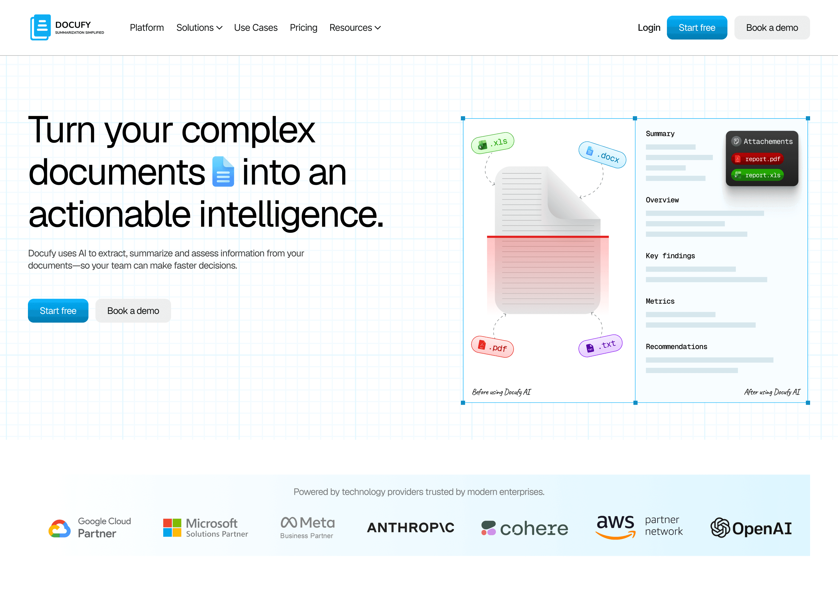
Redesigned Hero: Clear headline, before/after visual, dual CTA
Redesigned Hero: Clear headline, before/after visual, dual CTA

How It Works: New 3 step flow, added where none existed
How It Works: New 3 step flow, added where none existed

Use cases: One clean grid, no repeats
Use cases: One clean grid, no repeats

Security & Compliance: Consolidated into one consistent claim
Security & Compliance: Consolidated into one consistent claim
/ Docufy AI - After the redesign /
/ Docufy AI - After the redesign /
/ Docufy AI - After the redesign /

Expected Impact
Expected Impact
Expected Impact
This redesign focused on removing friction and inconsistency, not adding features. A clearer hero and 'How It Works' step help visitors understand the product in seconds, reducing early bounce. A consistent CTA hierarchy gives self-serve and enterprise buyers distinct paths, improving conversion clarity. Resolving the certification contradiction removes a credibility red flag for the audience most likely to verify compliance before signing up.
Overall, the goal was to turn Docufy's homepage from a feature list into a clear path from curiosity to confidence to action.
This redesign focused on removing friction and inconsistency, not adding features. A clearer hero and 'How It Works' step help visitors understand the product in seconds, reducing early bounce. A consistent CTA hierarchy gives self-serve and enterprise buyers distinct paths, improving conversion clarity. Resolving the certification contradiction removes a credibility red flag for the audience most likely to verify compliance before signing up.
Overall, the goal was to turn Docufy's homepage from a feature list into a clear path from curiosity to confidence to action.
This redesign focused on removing friction and inconsistency, not adding features. A clearer hero and 'How It Works' step help visitors understand the product in seconds, reducing early bounce. A consistent CTA hierarchy gives self-serve and enterprise buyers distinct paths, improving conversion clarity. Resolving the certification contradiction removes a credibility red flag for the audience most likely to verify compliance before signing up.
Overall, the goal was to turn Docufy's homepage from a feature list into a clear path from curiosity to confidence to action.